A market-leading product. A website that said otherwise.
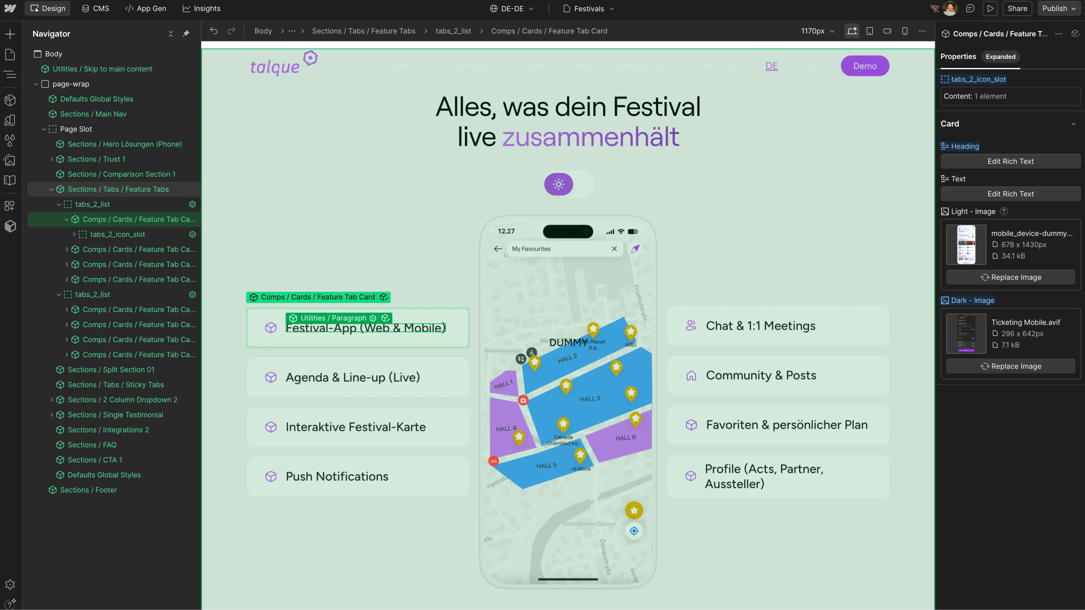
talque had the highest-rated event platform in the App Store, with 4.6 stars across 1,000+ reviews. Their website told a different story. We rebuilt it from the ground up: new visual system, new structure, 88 pages across two languages, and 65+ custom illustrations.
88 pages
Delivered in two languages, 176 total
10 weeks
Net delivery time, start to launch
65+
Custom product illustrations
Testimonial
What talque is saying
"We had a lot of landing pages that didn't match our main website because they ran on a different CMS. We wanted to unify them and stop relying on developers for content updates. Designbase redesigned the pages, built us a Webflow component library, and now we can assemble landing pages with a few clicks. The support, in particular, was really awesome. Everything ran smoothly, efficiently, and we finished on time."
lorem ipsum
lorem
Situation
The challenge
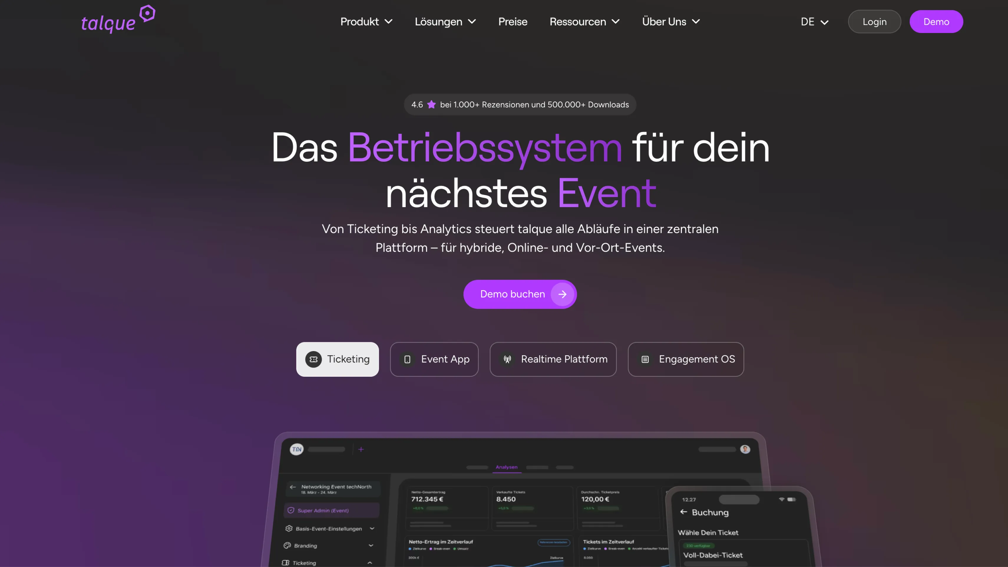
talque is one of the most feature-rich event platforms on the market. In the App Store and Google Play, they consistently ranked at the top of their category, with over 500,000 downloads and a 4.6-star rating from more than 1,000 reviews.
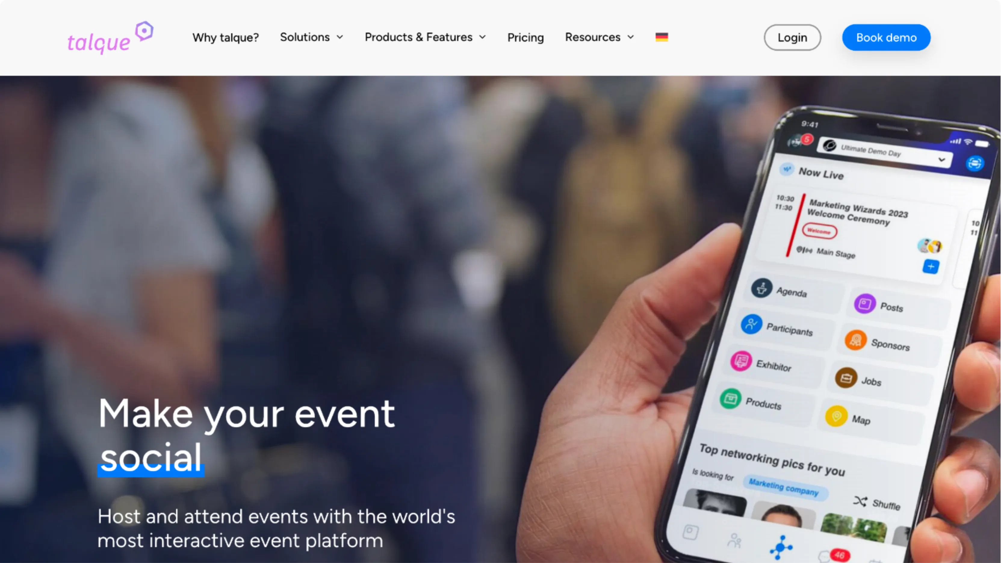
Their website reflected none of that. The CMS had become so heavily patched over time that routine content updates required a developer. As a result, the site had fallen years behind, no longer matching the product's features, its visual quality, or the positioning of talque's competitors. For a product that wins on depth and polish, the website was actively working against them.
About
Visual transformation
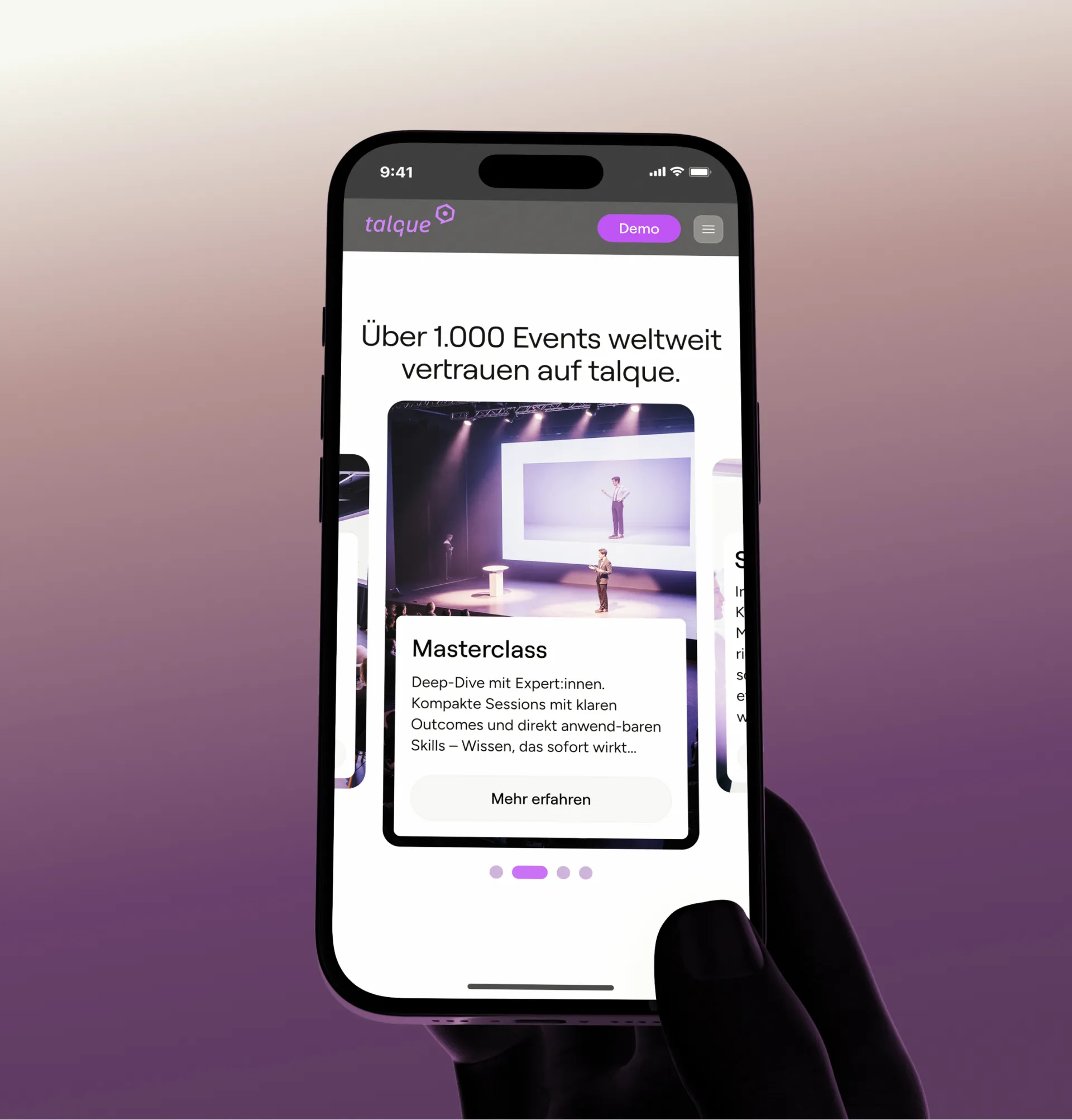
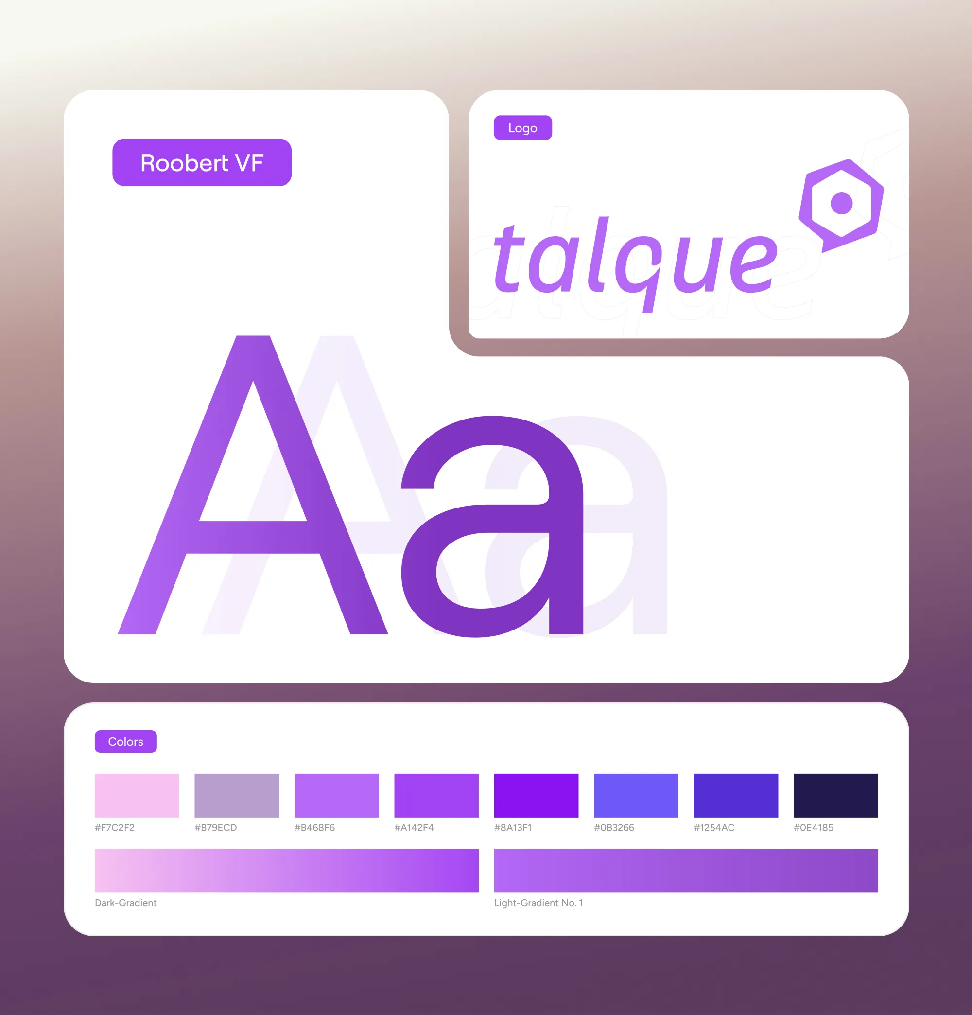
talque kept their logo and core brand color. Everything else was rebuilt. We developed a modernized visual system with an extended color palette, a new UI design language, and over 65 custom product illustrations that bring the platform's features to life across the site.
Click to
see before
Clear goals. Real results.
What we set to achieve
Business goals
Project scope
Reflect the actual product quality
The website needed to match what the product had become, not what it looked like three years ago.
Visual system and UI design
Extended brand identity including a modernized color palette and a complete new UI design language, built for web and applied consistently across all pages.
Map the right message to the right buyer
talque serves multiple industries with different needs. The site needed to speak directly to each segment, not present a one-size-fits-all product page.
Wireframes and solution page architecture
We mapped talque's product to their key buyer segments and designed custom user journeys for each industry. The strategic wireframe guide the right visitor toward the right message.
Enable content independence
The team needed to update and expand the site without routing every change through a developer.
First-draft copywriting
Strategic copy for all key pages delivered as a working foundation for the talque team to refine and finalize.
Scale across markets
With ambitions beyond the DACH region, the site needed a multilingual foundation built for growth, not retrofitted later.
Full Webflow build, bilingual
88 pages across two languages, 176 pages total. Including 7 Product Pages, 7 Solution Pages, Release Notes, Documentation, Integrations, Case Studies, and an About page.
UI and motion design
Component system
New landing pages in minutes, not in weeks...
Deliverables
What we actually delivered
176
Total pages delivered across two languages
11 weeks
Net delivery time from kickoff to launch
65+
Custom illustrations designed and built


Real projects. Real results.